Showcase
A field guide to the custom components, sections, and live demos powering this portfolio. Each block ships with a working preview and the source you can lift.
PolaroidItem
Tilted polaroid card with hover scale + rotation reset. Used on the About page to display location photos.
 Workspace
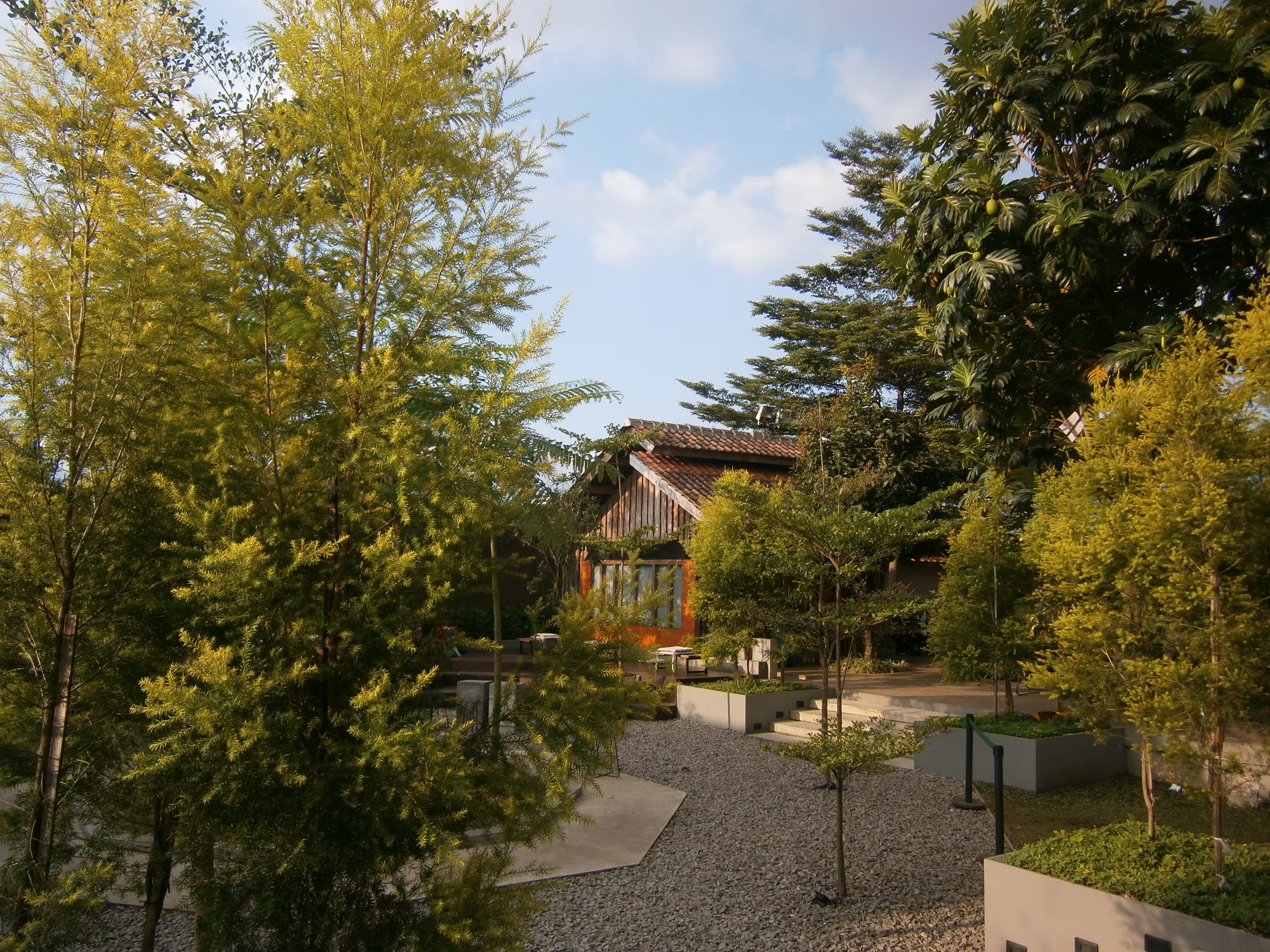 Code & Coffee
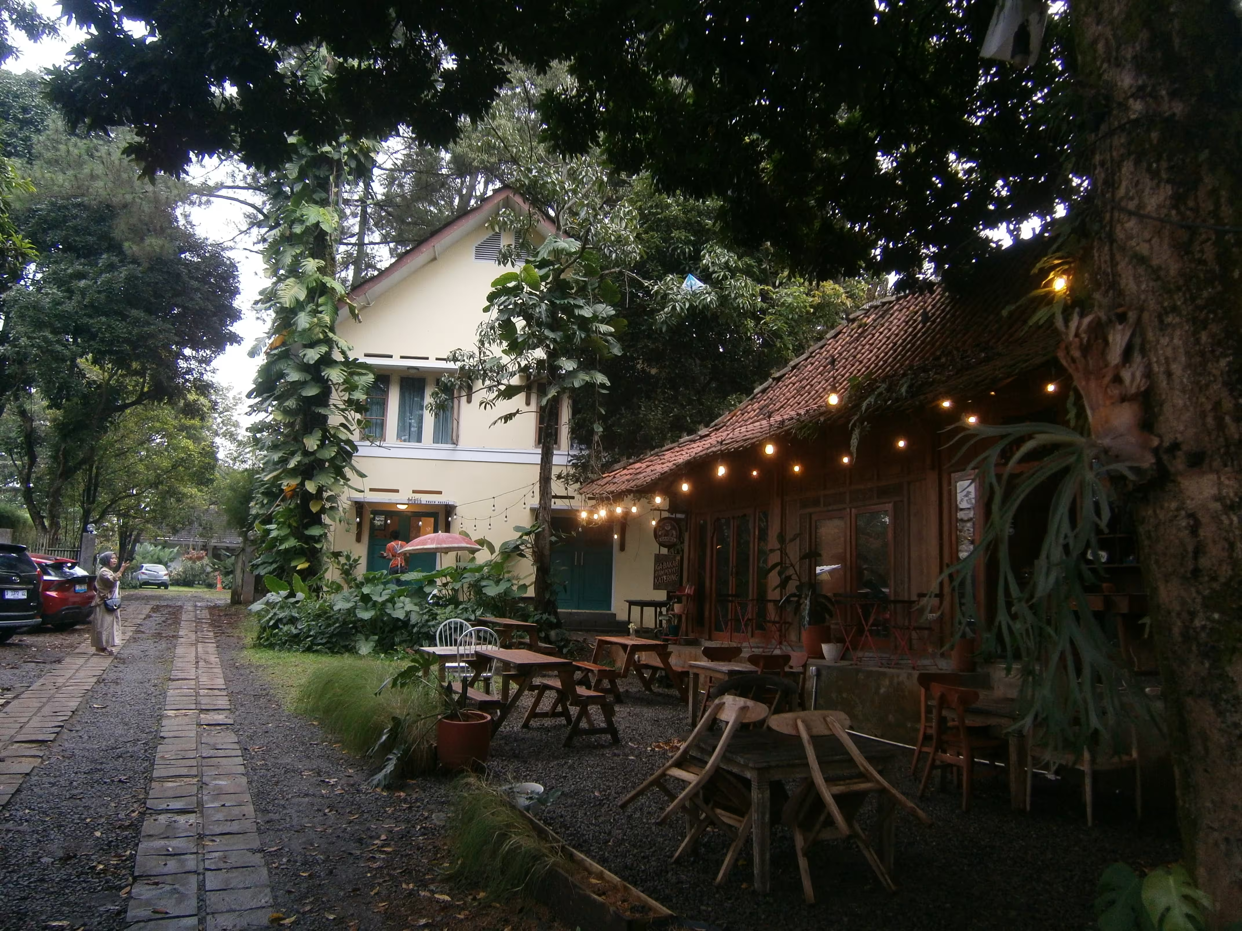 Architecture
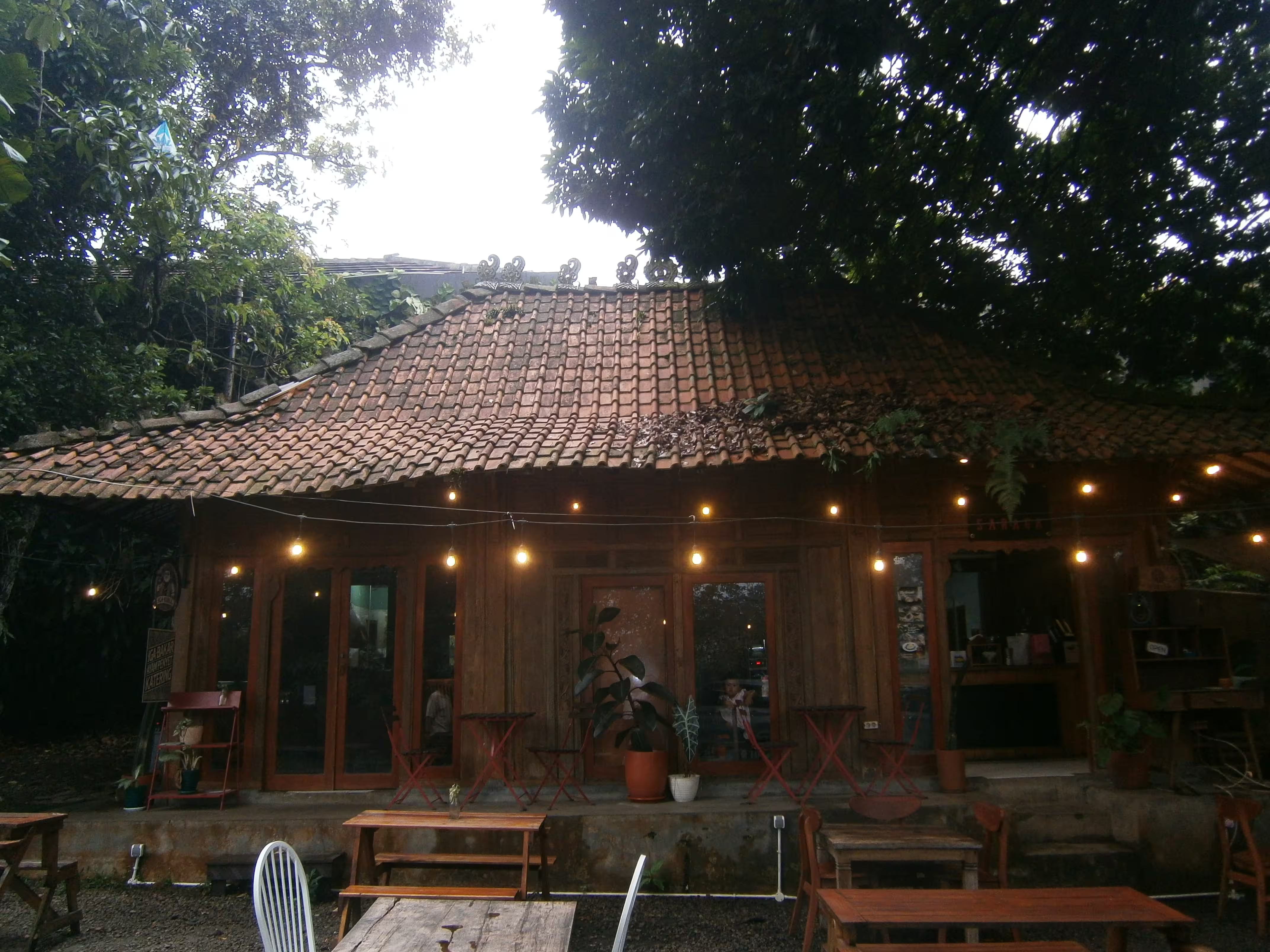 UI Build
<PolaroidItem
v-for="(image, index) in images"
:key="index"
:image="image"
:index="index"
/>ProjectEmbed
iframe wrapper with toolbar (traffic-light dots, fullscreen, open-in-tab) and lazy loader. Drop it inside any blog post via MDC.
<ProjectEmbed
  src="https://example.com/demo"
  title="Live demo"
  aspect="16/9"
/>
Motion entrance pattern
Reusable scale + blur intro built on motion-v. Wrap any node and stagger via the delay prop.
I fade in with a scale + blur
<Motion
  :initial="{ scale: 1.1, opacity: 0, filter: 'blur(20px)' }"
  :animate="{ scale: 1, opacity: 1, filter: 'blur(0px)' }"
  :transition="{ duration: 0.6, delay: 0.1 }"
>
  <h1>{{ title }}</h1>
</Motion>